Code
# load libraries for blog post
library(ggplot2)
library(plotly)
library(data.table)
library(kableExtra)
library(RColorBrewer) # for generating color palettesThe binomial test is a statistical test used to determine whether the proportion of cases in one of only two categories is equivalent to a pre-specified proportion. Categories could include the default rate of clients within the next 12 months, patients with high or low risk of heart disease, potential customers who are likely or not likely to make a purchase, or the rate of manufacturing defects. This widely used test finds applications in diverse fields, including credit risk, medicine, and manufacturing. It is also known to as the one-sample proportion test or test of one proportion.
As with all statistical tests, the binomial test has assumptions and conditions that must be met before applying it to real-life data:
The aim of this blog post is to showcase the ramifications of failing to meet “success-failure” condition critereon. Practical examples are coded in both R and Python languages.
# load libraries for blog post
library(ggplot2)
library(plotly)
library(data.table)
library(kableExtra)
library(RColorBrewer) # for generating color palettes# load packages for blog post
import numpy as np
import pandas as pd
import matplotlib.pyplot as plt
import plotly.graph_objects as go
from scipy.stats import binom, norm
# set style
plt.style.use("ggplot")Suppose that we have a sample where outcomes are binary - e.g. only “success” and “failure”. For the given sample, we would like to estimate the true proportion and also set up a statistical test to verify whether if the proportion is equal to some value, e.g. expected.
First, we calculate a point estimate:
\[p = \frac{n_s}{n}\]
, where \(n\) - sample size and \(n_s\) - the number of successful observations (or it can be the number of failures).
\[SE = \sqrt{\frac{p \cdot (1 - p)}{n}}\] , where \(SE\) is standard error. To perform a test, one first needs to derive a Null hypothesis:
\[H_0: p = p_0\]
and an alternative hypothesis:
Finally, we needs to calculate \(Z\) statistics:
\[Z = \frac{p_0-p}{SE}\]
Obtaining the value of \(Z\) enables us to either compute confidence intervals (\(CI\)) or reject \(H_0\) in favor of \(H_A\)
To approximate any distribution as normal, it is imperative to calculate the mean (\(\mu\)) and standard deviation (\(\sigma\)). For the Binomial distribution, which consists of a number of experiments \(n\) and a probability \(p\), the mean of the normal distribution is:
\[\mu = n \cdot p\]
and the standard deviation:
\[\sigma = \sqrt{n \cdot p \cdot (1 - p)}.\]
Meeting the “Success-Failure” condition is crucial to approximate Binomial distribution as Normal. Below, I present an instance of 50 Binomial events with varying probability rates of 5%, 30%, and 90%. In tabs binomial vs normal binomial distributions are plotted against it’s normal distribution approximation.
# probabilities
p <- c(0.05, 0.3, 0.9)

# successes
x <- 0:50

# create data.table
dt <- CJ(p, x)

# add size column
dt[, size := 50]

# add binomial probability
dt[, Binomial := dbinom(x, size=size, prob=p) * 100]

# create label column
dt[, label := paste0("Prob: ", round(p*100),
                     "%, exp. successes ", round(p*size),
                     " exp. failures ", round((1-p)*size))]

# calculate mean and standard deviation
dt[, mu := size * p]
dt[, st.dev := sqrt(p * (1 - p) * size)]

# get norm distribution
dt[, Normal := dnorm(x, mean=mu, sd = st.dev) * 100]

# convert to ordered factor
dt[, label := factor(label, levels=c("Prob: 5%, exp. successes 2 exp. failures 48",
                                     "Prob: 30%, exp. successes 15 exp. failures 35",
                                     "Prob: 90%, exp. successes 45 exp. failures 5" ))]

# reshape for plotting
dt.plot <- melt(dt, id.vars = c("x", "label"),
                measure.vars = c("Binomial", "Normal"),
                variable.name = c("Type"),
                value.name = c('prob'))

# create figure
fig <- ggplot(dt.plot, aes(x, prob, color=Type)) + geom_point() + facet_wrap(~label, ncol = 1) + ylab("Probability, %")
fig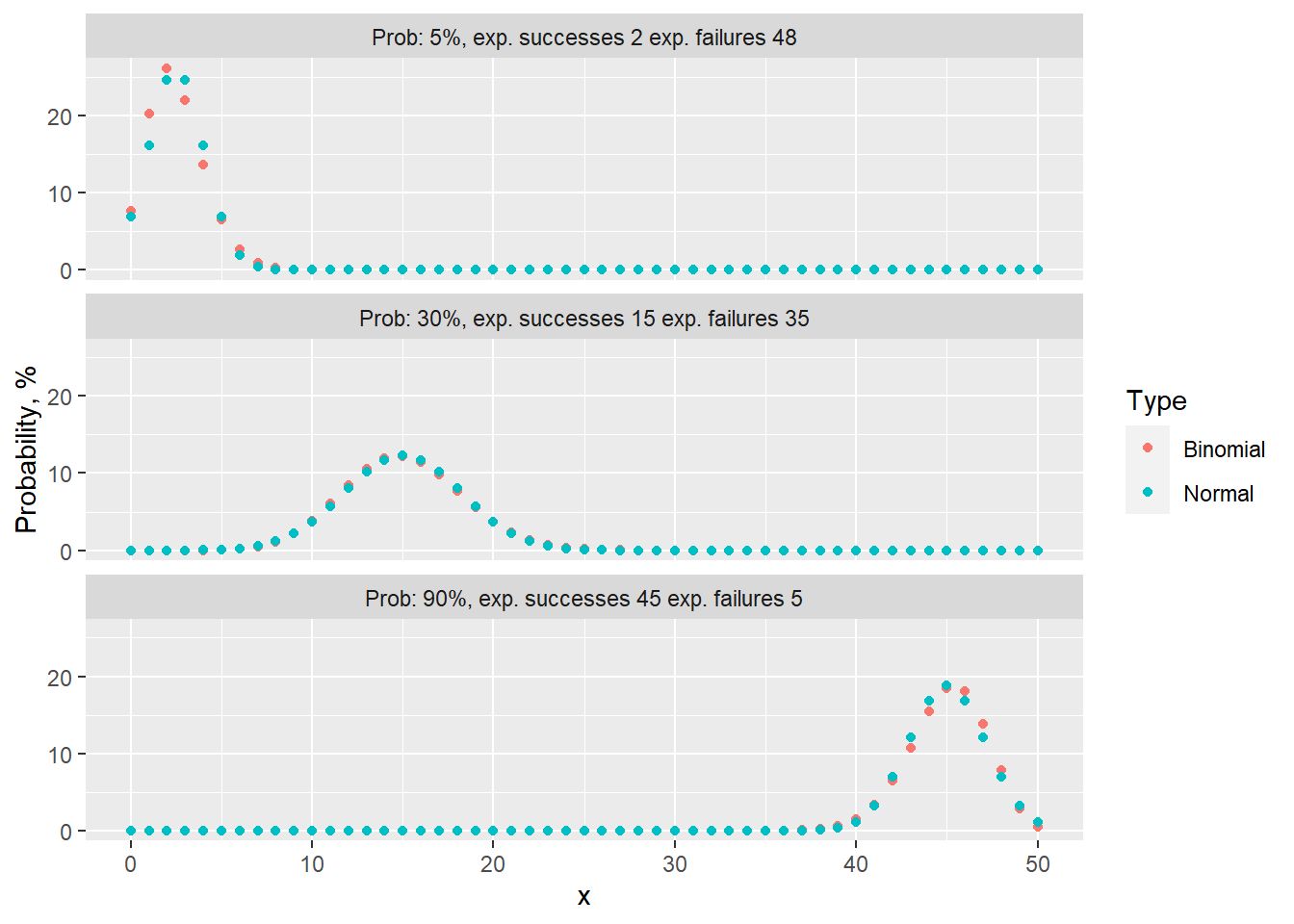
# calculate error (use data.table from previous code chunk)
dt[, Error := Binomial - Normal]

# create figure
fig <- ggplot(dt, aes(x, Error)) + geom_point() + facet_wrap(~label, ncol = 1) + ylab("Error (binom. - norm.), %")
fig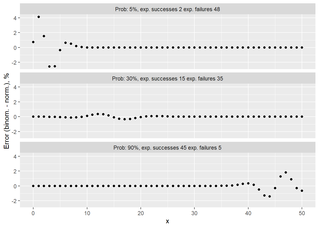
# probabilities
p = [0.05, 0.3, 0.9]

# successes
x = np.arange(51)

# create DataFrame with all combinations
df_1 = pd.DataFrame({'p': p})
df_2 = pd.DataFrame({'x': x})

# create key for joining
df_1['key'] = 0
df_2['key'] = 0

# perform cross join
df = df_1.merge(df_2, on='key', how='outer')

# drop key column
del df['key']

# add size value
df['size'] = 50

# calculate binomial probability
df['Binomial'] = binom.pmf(df['x'], df['size'], df['p']) * 100

# calculate mean and standard deviation
df['mu'] = df['size'] * df['p']
df['se'] = np.sqrt(df['p'] * (1 - df['p']) / df['size'])
df['std'] = np.sqrt(df['p'] * (1 - df['p']) * df['size'])

# get norm distribution
df['Normal'] = df.apply(lambda x: norm.pdf(x['x'], x['mu'], x['std']) * 100, axis = 1)

# create figure
fig, ax = plt.subplots(3, 1, sharey=True)

# iterate over probabilities
for i, _p in enumerate(p):
  # select data for plotting
  dt_plot = df.loc[df['p'] == _p].copy()

  # plot binomial and normal distributions
  ax[i].plot(dt_plot['x'], dt_plot['Binomial'], "o", label='Binomial');
  ax[i].plot(dt_plot['x'], dt_plot['Normal'], "-", label='Normal', linewidth=3);

  # add sub titles
  ax[i].set_title(f"Prob. {_p*100:.0f}% expected {50*_p:.0f} successes and {50*(1-_p):.0f} failures", fontsize=8);

# add labels
ax[1].set_ylabel("Probability, %");
ax[2].set_xlabel("x");

# add legend and white background
legend = ax[1].legend(frameon = 1);
frame = legend.get_frame();
frame.set_color('white');

plt.tight_layout()
plt.show()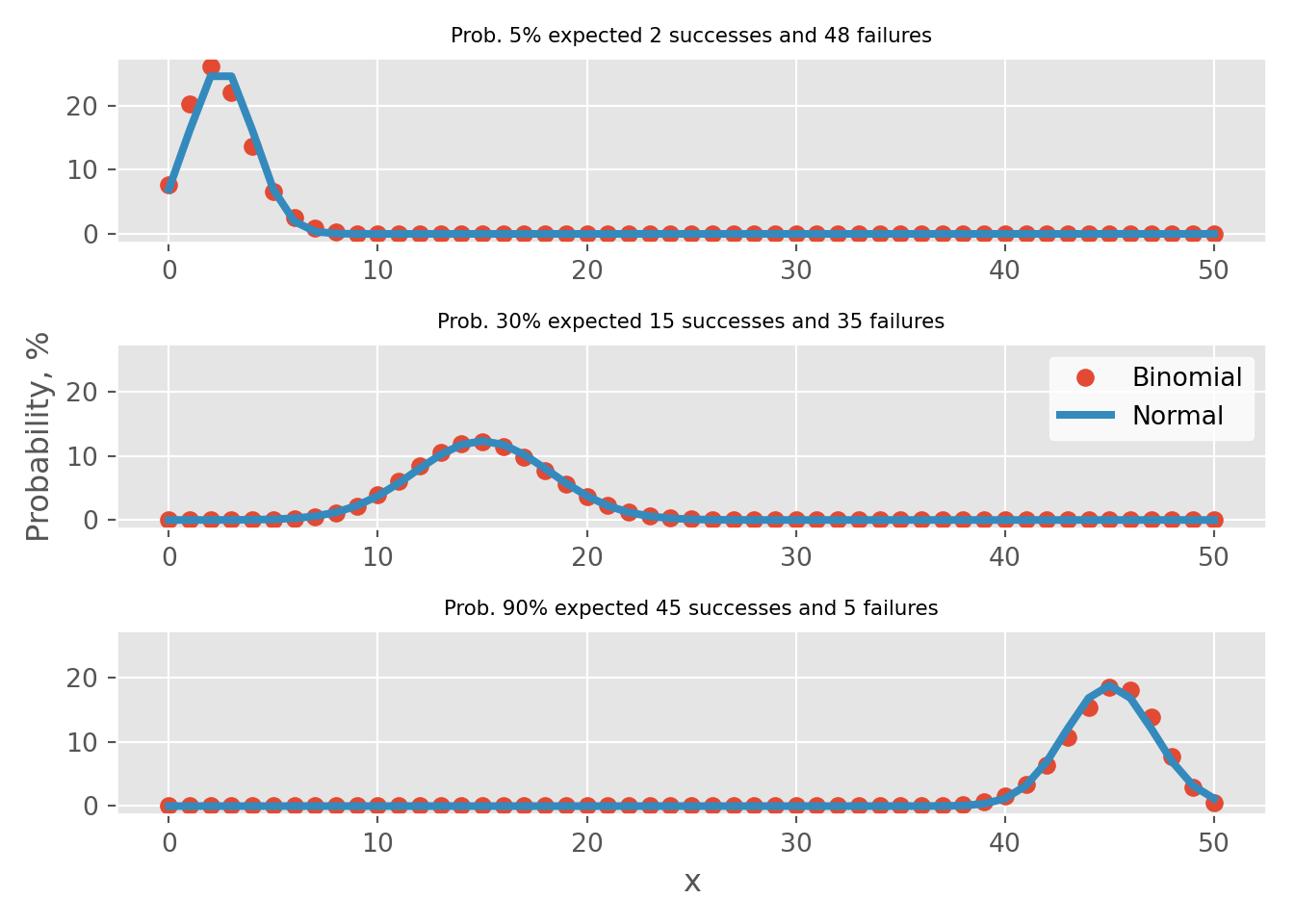
# calculate error (use DataFrame from previous code chunk)
df['Error'] = df.Binomial - df.Normal

# create figure
fig, ax = plt.subplots(3, 1, sharey=True)

# iterate over probabilities
for i, _p in enumerate(p):
  # select data for plotting
  dt_plot = df.loc[df['p'] == _p]

  # plot binomial and normal distributions
  ax[i].plot(dt_plot['x'], dt_plot['Error'], "o", color='k', markersize=3);

  # add sub titles
  ax[i].set_title(f"Prob. {_p*100:.0f}% expected {50*_p:.0f} successes and {50*(1-_p):.0f} failures", fontsize=8);

# adjust limits for better readability
ax[0].set_ylim(-4.9, 4.9)

# add labels
(-4.9, 4.9)ax[1].set_ylabel("Probability, %")
ax[2].set_xlabel("x")
plt.tight_layout()
plt.show()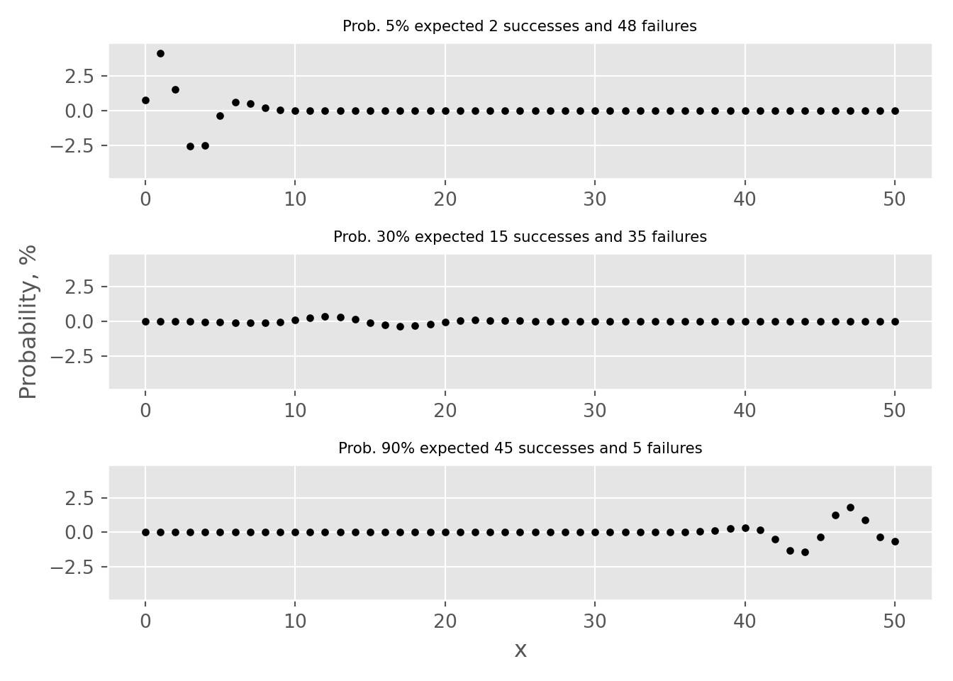
Out of 3 examples, the “Success-Failure” criterion is only applicable for the case where p=30%. By examining the error tabs, one can see that there is an approximation error. This refers to the disparity between the probabilities calculated using the Binomial and Normal distribution approximations. In particular, for the examples where p is set to 5% or 90%, this error can result in an overestimation or underestimation by more than 2% for point estimates.
To better understand approximation error, it’s important to consider the differences between the discrete binomial distribution and the continuous normal distribution. The binomial distribution represents the probability of getting k successes in n independent trials, each with probability p of success. Its probability space is bounded between 0 and k events, where k represents the number of attempts. In contrast, the normal distribution represents a continuous probability distribution of a random variable with an infinite range of possible values i.e. one can calculate probability to observer 2.5 successes after 10 trials. Furthermore, apart from the case where p=50%, the binomial distribution is not symmetrical, unlike the normal distribution. This means that the area under the curve on one side of the mean (expected number of successes) is not equal to the area under the curve on the other side.
Due to these differences, approximating the binomial distribution using the normal distribution will result in an approximation error. This error will be calculated as the difference between the probabilities calculated using the two distributions. In order to visualize approximation error, I will use interactive charts generated by the plotly library/package. Custom plotting functions were created in R and Python.
PlotDistributions <- function(prob, size){
  # create observation vector
  if (prob < 0.5){
    x <- 0:(size*prob*3)
  } else {
    x <- (size - 3 * size * (1 - prob)):size
  }

  # get probabilities for both binomial and norm distributions
  y.binom <- dbinom(x, size=size, prob=prob) * 100
  y.norm <- dnorm(x, mean=size * prob, sd = sqrt(prob * (1 - prob) * size)) * 100

  # create data table for plotting
  dt <- data.table(x = x,
                   prob.binom = y.binom,
                   prob.norm = y.norm)

  # add columns with hover information
  dt[, text.1 := paste0('Point estimate probability<br>to observer exactly ', x,
                        ' events is ', round(y.binom, 3), "%")]
  dt[, text.2 := paste0('Point estimate probability<br>to observer exactly ', x,
                        ' events is ', round(y.norm, 3), "%")]
  dt[, text.3 := paste0('Point estimate error<br>to observer exactly ', x,
                        ' events is ', round(y.binom - y.norm, 3), "%")]
  # create figure
  fig <- plot_ly(data = dt, type = 'scatter', mode = 'lines')

  # add traces
  fig <- fig %>% add_trace(x = ~x, y = ~prob.norm, text = ~text.1,
                           name = 'Normal',mode = 'lines',
                           hoverinfo = 'text',
                           line = list(color = "#FF6666", width = 5))
  fig <- fig %>% add_trace(x = ~x, y = ~prob.binom, text = ~text.2,
                           name = 'Binomial',mode = 'markers',
                           hoverinfo = 'text',
                           marker = list(color = "#3399FF", size = 12))
  fig <- fig %>% add_trace(x = ~x, y = ~(prob.binom-prob.norm), text = ~text.3,
                           name = 'Error',mode = 'lines+markers',
                           hoverinfo = 'text',
                           line = list(color = "black", width = 5),
                           marker = list(color = "black", size = 12),
                           visible = "legendonly")

  # update layout
  fig <- fig %>% layout(title = paste0("p = ", round(prob*100), "%, ", size, " trials"),
                        xaxis = list(title = "Observations"),
                        yaxis = list (title = "Probability, %"),
                        hovermode = "x unified",
                        legend=list(title=list(text='<b> Distributions </b>')))
  # return figure
  return(fig)
}# create function for plotting distributions
def plot_distributions(prob, size):
# create observation vector
x = np.arange(int(size*prob*3))
# get probabilities for both binomial and norm distributions
y_binom = binom.pmf(x, n=size, p=prob) * 100
# calculate variance and sigma
variance = size * prob * (1 - prob)
sigma = np.sqrt(variance)
y_norm = norm.pdf(x, loc = size * prob, scale = sigma) * 100
# generate Data.Frame
df = pd.DataFrame({'x': x, 'binom': y_binom, 'norm': y_norm})
# calculate error
df['error'] = df.binom - df.norm
error = df.binom - df.norm
# generate hover messages
df['text_1'] = df.apply(lambda x: f'Point estimate probability<br>to observer exactly {x["x"]:.0f} events is {x["binom"]:.3f}%', axis = 1)
df['text_2'] = df.apply(lambda x: f'Point estimate probability<br>to observer exactly {x["x"]:.0f} events is {x["norm"]:.3f}%', axis = 1)
df['text_3'] = df.apply(lambda x: f'Point estimate error<br>to observer exactly {x["x"]:.0f} events is {x["error"]:.3f}%', axis = 1)
# create figure
fig = go.Figure()
fig.add_trace(go.Scatter(x=x, y=y_norm, text = df['text_1'].values,
mode='lines', name='Normal', hoverinfo = 'text',
line=dict(color='#FF6666', width=5)))
fig.add_trace(go.Scatter(x=x, y=y_binom, text = df['text_2'].values,
mode='markers', name='Binomial', hoverinfo = 'text',
marker=dict(color='#3399FF', size=12)))
fig.add_trace(go.Scatter(x=x, y=error, text = df['text_3'].values,
mode='markers', name='Error', hoverinfo = 'text',
marker=dict(color='black', size=12),
visible = "legendonly"))
# Edit the layout
fig.update_layout(title=f"p = {prob*100:.1f}%, {size} trials",
xaxis_title='Observations',
yaxis_title='Probability, %',
template="ggplot2",
hovermode="x unified")
return figNext, I have provided examples using small probabilities of 99%, 95%, 0.5%, and 0.1% with either 5 expected failures or 5 expected successes. To view the distribution of errors, simply click on the error line on the chart legend.
# return figure
PlotDistributions(0.999, 5000)# return figure
PlotDistributions(0.995, 1000)# use python helper function from above
fig = plot_distributions(0.005, 1000)
fig# use python helper function from above
fig = plot_distributions(0.001, 5000)
figLet’s say we have a hypothetical model with a small probability of occurrence, such as a 0.5% chance of manufacturing defects or a 0.5% chance of clients defaulting on their credit obligations. To meet the “Success-Failure” condition for this model, we would need to collect at least 2000 observations, i.e. manufacture 2000 devices or issue credit to 2000 obligators. In the 0.5% (Python) tab, one can see that if we have only collected 1000 events and expect 5 failures/defaults, normal distribution approximation overestimates the probability for \(\ge5\) and underestimates it for \(\le5\), as evident from visual inspection and reviewing error estimates for different outcomes (select error line on legend to view error distribution). For cases then we are very certain, e.g. 99.9% (R), overestimation if for cases \(\le5\) and underestimation for \(\ge5\). From visual inspection, one can observe that the smaller the probability, the larger the error between point estimates becomes.
Let’s try to quantify approximation error by calculating 3 probabilities using binomial and it’s approximation using normal distribution:
After calculating, these probabilities can be compared them by using ratios e.g. \(ratio_1 = \frac{p_1 (binom.)}{p_1 (norm.)}\). In the table below, \(p_1\) probabilities calculated using different distributions are presented. I also provide all 3 ratios, which shows by how much normal distribution overestimates/underestimates binomial distribution. For all cases 5 successes/failures are expected.
# generate data.table
dt <- data.table(p = c(0.999, 0.995, 0.99, 0.95, 0.8,
                       0.5,
                       0.2, 0.05, 0.01, 0.005, 0.001),
                 N = c(5000, 1000, 500, 100, 25,
                       10,
                       25, 100, 500, 1000, 5000))
# expected events
dt[, x := p * N]

# get binomial, normal probabilities and their ratio
dt[, binom.p1 := dbinom(x, size=N, prob=p) * 100]
dt[, norm.p1 := dnorm(x, mean=N * p, sd = sqrt(p * (1 - p) * N)) * 100]
dt[, ratio.1 := binom.p1/norm.p1 * 100]

# calculate p2 probabilities
dt[, binom.p2 := pbinom(x-1, size=N, prob=p) * 100]
dt[, norm.p2 := (1-dnorm(x, mean=N * p, sd = sqrt(p * (1 - p) * N)))/2 * 100]

# calculate p3 probabilities
dt[, binom.p3 := (1 - pbinom(x, size=N, prob=p)) * 100]

# calculate ratios
dt[, ratio.2 := binom.p2/norm.p2 * 100]
dt[, ratio.3 := binom.p3/norm.p2 * 100]

# round columns for better readability
cols <- names(dt)[4:11]
dt[,(cols) := round(.SD, 3), .SDcols=cols]

# convert probability to percents
dt[, p := round(p * 100, 1)]

# remove column
dt$x <- NULL

# generate table with first few rows and columns
knitr::kable(dt[, c(1:5, 9, 10)], col.names = c("p, %", "N", "p1 (binom.), %", "p1 (norm.), %", "ratio 1", "ratio 2", "ratio 3")) %>%
kable_styling(bootstrap_options = c("striped", "hover", "condensed"))| p, % | N | p1 (binom.), % | p1 (norm.), % | ratio 1 | ratio 2 | ratio 3 |
|---|---|---|---|---|---|---|
| 99.9 | 5000 | 17.556 | 17.850 | 98.349 | 93.497 | 107.220 |
| 99.5 | 1000 | 17.591 | 17.886 | 98.349 | 93.538 | 107.181 |
| 99.0 | 500 | 17.635 | 17.931 | 98.349 | 93.589 | 107.132 |
| 95.0 | 100 | 18.002 | 18.305 | 98.345 | 94.008 | 106.734 |
| 80.0 | 25 | 19.602 | 19.947 | 98.267 | 95.764 | 105.099 |
| 50.0 | 10 | 24.609 | 25.231 | 97.535 | 100.832 | 100.832 |
| 20.0 | 25 | 19.602 | 19.947 | 98.267 | 105.099 | 95.764 |
| 5.0 | 100 | 18.002 | 18.305 | 98.345 | 106.734 | 94.008 |
| 1.0 | 500 | 17.635 | 17.931 | 98.349 | 107.132 | 93.589 |
| 0.5 | 1000 | 17.591 | 17.886 | 98.349 | 107.181 | 93.538 |
| 0.1 | 5000 | 17.556 | 17.850 | 98.349 | 107.220 | 93.497 |
There results show that when \(p > 50\%\) overestimation is observed on the right-hand side of distribution and opposite is true for \(p < 50\%\). The ratio between \(p_1\) probabilities is the same across all examples - it is defined by number of expected outcomes and not probability. Overestimation \(ratio_2>100\%\) are the same for \(p > 50\%\) cases as underestimation \(ratio_3<100\%\). As implied probability becomes closer to 50%, the binomial distribution becomes more symmetrical so both \(ratio_2\) and \(ratio_3\) becomes closer to 100%.
Another way to measure approximation error is to calculate the total absolute approximation error, which is obtained by subtracting the normal distribution approximation from the binomial distribution approximation. The reason for using total error instead of the mean absolute error is that for the latter calculations are affected by very small errors at the edge of distributions. The key idea is that as the number of observations, i.e. the expected number of successes/failures increases, the total error between point estimates will decrease. Similar to the previous example, the total approximation error is calculated for the same probabilities with 5 expected successes/failures.
# generate data.table
dt <- data.table(p = c(0.999, 0.995, 0.99, 0.95, 0.8,
                       0.5,
                       0.2, 0.05, 0.01, 0.005, 0.001),
                 N = c(5000, 1000, 500, 100, 25,
                       10,
                       25, 100, 500, 1000, 5000))
# expected events
dt[, x := p * N]

# ugly, but quick way to calculate approximation error
for (p.tmp in dt$p){
  # generate vector
  x.vect <- 0:dt[p == p.tmp, N]

  # get probabilities for both binomial and norm distributions
  y.binom <- dbinom(x.vect, dt[p == p.tmp, N], p.tmp)
  y.norm <- dnorm(x.vect, mean=dt[p == p.tmp, N] * p.tmp, sd = sqrt(p.tmp * (1 - p.tmp) * dt[p == p.tmp, N]))

  # sum absolute error
  y.err <- sum(abs(y.binom - y.norm))

  # add error term
  dt[p == p.tmp, tot.abs.error := round(y.err*100, 3)]
}

# convert probability to percents
dt[, p := round(p * 100, 1)]

# remove column
dt$x <- NULL

# generate table with first few rows and columns
knitr::kable(dt, col.names = c("p, %", "N", "Total absolute error, %")) %>%
kable_styling(bootstrap_options = c("striped", "hover", "condensed"))| p, % | N | Total absolute error, % |
|---|---|---|
| 99.9 | 5000 | 10.804 |
| 99.5 | 1000 | 10.754 |
| 99.0 | 500 | 10.691 |
| 95.0 | 100 | 10.158 |
| 80.0 | 25 | 7.686 |
| 50.0 | 10 | 2.381 |
| 20.0 | 25 | 7.686 |
| 5.0 | 100 | 10.158 |
| 1.0 | 500 | 10.691 |
| 0.5 | 1000 | 10.754 |
| 0.1 | 5000 | 10.804 |
The table above shows that the total point approximation error is the smallest when the probability is the largest (p=50%). However, for situations that are very likely, e.g. 99.9%, or very unlikely (0.1%), where we expect to see only a few successes or failures out of a large number of trials, approximating the binomial distribution with normal distribution can lead to more than 10% total point estimate error.
Next, let’s compare cumulative probabilities for different examples based on both probabilities (p) and expected values (EV). To highlight commonly used two-sided null hypothesis rejection levels, I have added 95% confidence intervals (black dashed line) and 99% confidence intervals (red dashed line).
# helper function for plotting
vline <- function(x = 0, color = "black") {
  list(
    type = "line",
    y0 = 0,
    y1 = 1,
    yref = "paper",
    x0 = x,
    x1 = x,
    line = list(color = color, dash = "dot")
  )
}

# helper function to draw cum. probabilities
PlotCumProbs <- function(p, N){

  # for adjusting plot x limits
  x.ratio <- p*N

  # create vector depending on probability
  if (p <= 0.5){
    if (N*p >= 10){
      x <- 0:max((N*p*2), N*p)
    } else {
      x <- 0:max((N*p*3), N*p)
    }
  } else {
    if (N*(1-p) >= 10){
      x <- max((N - 2 * N * (1 - p)), 0):N
    } else {
      x <- max((N - 3 * N * (1 - p)), 0):N
    }
  }

  # calculate z values as events for different confidence intervals
  Z.95.left <- (N * p - 1.960 * sqrt(p * (1 - p) * N))
  Z.99.left <- (N * p - 2.576 * sqrt(p * (1 - p) * N))
  Z.95.right <- (N * p + 1.960 * sqrt(p * (1 - p) * N))
  Z.99.right <- (N * p + 2.576 * sqrt(p * (1 - p) * N))

  # calculate cum. probabilities for both binomial and normal distributions
  y.binom <- pbinom(x, size=N, prob=p) * 100
  y.norm <- pnorm(x, mean=N * p, sd = sqrt(p * (1 - p) * N)) * 100

  # create data.table for plotting
  dt <- data.table(x = x, y.binom = y.binom, y.norm = y.norm)

  # calculate error
  dt[, error := y.binom - y.norm]

  # add hover text messages
  dt[, text.1 := paste0(round(y.binom, 3), "%")]
  dt[, text.2 := paste0(round(y.norm, 3), "%")]
  dt[, text.3 := paste0(round(error, 3), "%")]

  # create figure
  fig <- plot_ly(data = dt, type = 'scatter', mode = 'lines')

  # add traces
  fig <- fig %>% add_trace(x = ~x, y = ~y.norm, text = ~text.1,
                           name = 'Normal',mode = 'lines',
                           hoverinfo = 'text',
                           line = list(color = "#FF6666", width = 5))
  fig <- fig %>% add_trace(x = ~x, y = ~y.binom, text = ~text.2,
                           name = 'Binomial',mode = 'markers',
                           hoverinfo = 'text',
                           marker = list(color = "#3399FF", size = 12))
  fig <- fig %>% add_trace(x = ~x, y = ~error, text = ~text.3,
                           name = 'Error',mode = 'lines+markers',
                           hoverinfo = 'text',
                           line = list(color = "black", width = 5),
                           marker = list(color = "black", size = 12))

  # update layout
  fig <- fig %>% layout(title = paste0("p = ", round(p*100, 1), "%, ", N, " trials (EV = ", x.ratio, ")"),
                        xaxis = list(title = "Observations"),
                        yaxis = list (title = "Probability, %"),
                        hovermode = "x unified",
                        shapes = list(vline(Z.99.left, color='red'), vline(Z.95.left), vline(Z.95.right), vline(Z.99.right, color='red')),
                        legend=list(title=list(text='<b> Distributions </b>')))

  # return figure object
  return(fig)
}

# plot example for 0.1%
PlotCumProbs(0.001, 5000)# plot example for 1%
PlotCumProbs(0.01, 500)# plot example for 10%
PlotCumProbs(0.1, 100)# plot example for 20%
PlotCumProbs(0.2, 75)# plot example for 50%
PlotCumProbs(0.5, 10)# plot example for 50%
PlotCumProbs(0.5, 20)# plot example for 50%
PlotCumProbs(0.5, 30)# plot example for 80%
PlotCumProbs(0.8, 75)# plot example for 90%
PlotCumProbs(0.9, 100)# plot example for 99%
PlotCumProbs(0.99, 500)# plot example for 99.9%
PlotCumProbs(0.999, 5000)The first thing to note is that it’s not possible to test a 2-sided hypothesis for a low EV example. Take a look at the tabs with “(5 EV)” in their name - the red dashed lines fall outside the range of viable outcomes, except for 50% (5EV) case. In this example, if you conduct 10 trials and observe either 0 or 10 successes, you can reject the null hypothesis \(H_0 \ne p\) with a 99% confidence interval. However, as the sample size increases i.e. one gets larger EV, the distribution widths become narrower. This means that 2-sided tests with a 99% confidence interval become viable for other probability values, as seen in the example with an 20% (15 EV). Additionally, when comparing distributions with the same EV but different probabilities, we see that the error between the binomial distribution and its approximation using the normal distribution is very similar.
Finally, let’s now explore how much \(ratio_1\) and total absolute approximation errors are affected by the sample size. In the examples below, the sample sizes were adjusted based on the number of expected successes/failures. For instance, to observe 5 EV with p=1%, one needs 500 observations and for p=20%, one needs 25 observations. However, this approach has some drawbacks, such as being difficult to normalize for specific cases. For example, to observe 7 EV with p=15%, one needs 46.66 observations. In such cases, the number of observations was rounded down to the nearest integer, resulting in some spiky line charts for these specific cases.
# generate data.table with expected values and sample probabilities
probs <- c(0.001, 0.01, 0.1, 0.2, 0.3, 0.4, 0.45, 0.5, 0.55, 0.6, 0.7, 0.8, 0.9, 0.99, 0.999)
dt <- CJ(Sucesses = c(1:50), p = probs)

# get probability and sample size for expected values
dt[p <= 0.5, N := ceiling(Sucesses / p)]
dt[p > 0.5, N := ceiling(Sucesses / (1 - p))]

# get number of failures
dt[, Failures := N - Sucesses]

# calculate probabilities to observe expected number of observations
dt[p <= 0.5, binom.p1 := dbinom(Sucesses, size = N, prob=p) * 100]
dt[p > 0.5, binom.p1 := dbinom(Failures, size = N, prob=p) * 100]
dt[p <= 0.5, norm.p1 := dnorm(Sucesses, mean = N * p, sd = sqrt(p * (1 - p) * N)) * 100]
dt[p > 0.5, norm.p1 := dnorm(Failures, mean = N * p, sd = sqrt(p * (1 - p) * N)) * 100]

# get ratio between point estimates
dt[, ratio.1 := round(binom.p1/norm.p1 * 100, 3)]

# for coloring get probability
dt[, Probability := paste0(round(p * 100, 1), "%")]

# text message for hover (decided not to use this column)
dt[, text := paste0(Probability, " with ", N, " attempts: ", ratio.1)]

# generate color palette
# code example taken from
# https://stackoverflow.com/questions/15282580/how-to-generate-a-number-of-most-distinctive-colors-in-r
n <- length(probs)
qual_col_pals = brewer.pal.info[brewer.pal.info$category == 'qual',]
col_vector = unlist(mapply(brewer.pal, qual_col_pals$maxcolors, rownames(qual_col_pals)))

# generate figure
fig <- plot_ly(dt,
               x = ~Sucesses,
               y = ~ratio.1,
               color = ~Probability,
               colors = col_vector,
               line = list(width = 4))
fig <- fig %>% add_lines()

# with log scales
fig <- layout(fig,
              hovermode = "x unified",
              yaxis = list(type = "log", title = "Ratio 1, %"),
              xaxis = list(title = "Expected sucessess/failures"),
              legend=list(title=list(text='<b> Probabilities </b>')))

fig# generate data.table with expected values and sample probabilities
probs <- c(0.001, 0.01, 0.1, 0.2, 0.3, 0.4, 0.45, 0.5, 0.55, 0.6, 0.7, 0.8, 0.9, 0.99, 0.999)
dt <- CJ(Sucesses = c(1:100), p = probs)
# get probability and sample size for expected values
dt[p <= 0.5, N := ceiling(Sucesses / p)]
dt[p > 0.5, N := ceiling(Sucesses / (1 - p))]
# get number of failures
dt[, Failures := N - Sucesses]
# ugly, but quick way to calculate approximation error
for (idx in 1:nrow(dt)){
# generate vector
x.vect <- 0:dt[idx, N]
# select probaiblity
p.tmp <- dt[idx, p]
# get probabilities for both binomial and norm distributions
y.binom <- dbinom(x.vect, dt[idx, N], p.tmp)
y.norm <- dnorm(x.vect, mean=dt[idx, N] * p.tmp, sd = sqrt(p.tmp * (1 - p.tmp) * dt[idx, N]))
# sum absolute error
y.err <- sum(abs(y.binom - y.norm))
# add error term
dt[idx, tot.abs.error := round(y.err*100, 3)]
}
# generate color palette
# code example taken from
# https://stackoverflow.com/questions/15282580/how-to-generate-a-number-of-most-distinctive-colors-in-r
n <- length(probs)
qual_col_pals = brewer.pal.info[brewer.pal.info$category == 'qual',]
col_vector = unlist(mapply(brewer.pal, qual_col_pals$maxcolors, rownames(qual_col_pals)))
# for coloring get probability
dt[, Probability := paste0(round(p * 100, 1), "%")]
# generate figure
fig <- plot_ly(dt,
x = ~Sucesses,
y = ~tot.abs.error,
color = ~Probability,
colors = col_vector,
line = list(width = 4))
fig <- fig %>% add_lines()
# with log scales
fig <- layout(fig,
hovermode = "x unified",
yaxis = list(type = "log", title = "Total absolute error, %"),
xaxis = list(title = "Expected sucessess/failures"),
legend=list(title=list(text='<b> Probabilities </b>')))
figSurprisingly the \(ratio_1\) is inversely depended on probability - approximation error is the smallest for very likely or unluckily cases. The opposite is true for total absolute error - it is the smallest for p=50%. Even with 50 EV for small probabilities, i.e. 0.1% or 99.9% this error \(>3.5\%\). The key take away is that if we are looking ar large confidence intervals (CI), i.e. 95% or 99%, then 10 EV is sufficient to test hypothesis. If we would like to establish some intermediate values between, then for small probabilities, number of observations to collect should increased.
One should be very mindful when designing experiments for one-sample binomial test. Failing to meet “success-failure” condition would result in overestimation or underestimation of you \(H_0\) hypothesis results. For relatively large probabilities, 30%-70% one can use
Content for this blog post was prepared using following resources: